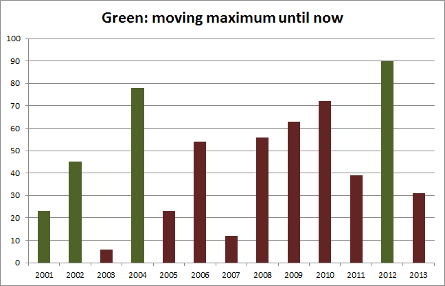
In this graph I will show the moving maximum in a different color than the other values.
Here are the data, A1:C14:
Here are the data, A1:C14:
| Year | Apples | Above |
| 2001 | 23 | 23 |
| 2002 | 45 | 45 |
| 2003 | 6 | 0 |
| 2004 | 78 | 78 |
| 2005 | 23 | 0 |
| 2006 | 54 | 0 |
| 2007 | 12 | 0 |
| 2008 | 56 | 0 |
| 2009 | 63 | 0 |
| 2010 | 72 | 0 |
| 2011 | 39 | 0 |
| 2012 | 90 | 90 |
| 2013 | 31 | 0 |
- In column C2:C14 from C2 down I created the formula:
=IF($B$2:$B$14>=SUBTOTAL(4;$B$2:B2);B2;0)
- The graph I based on both series.
- Series overlap: 100%.
- Gap width: 150%.
- I checked: Show data in hidden rows and columns.
- I hid column C.
You can also download the file movingmax.zip through this link:
Reacties